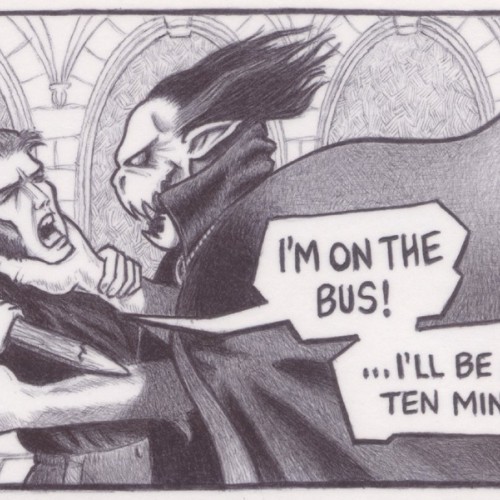
(Black biro on a 75mm x 125mm notecard) A juxtaposed image of a comic book type image with an unrelated speech caption. The type of thing you tend to hear from those on their mobile phones on buses.
(2B pencil on a 125mm x 75mm notecard) Another juxtaposed artwork that shows an everyday phrase used against a completely out of context comic book frame.
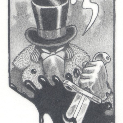
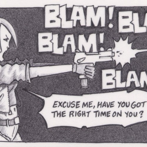
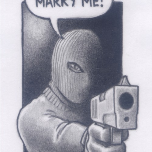
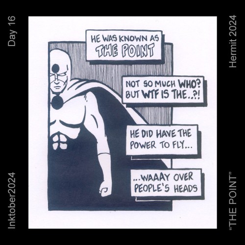
(2B pencil on a 139mm x 87mm postcard) A single comic book frame can sometimes tell a great story on its own, sometimes differing from the story in the actual comic book. An idea that I used with this frame that I drew.
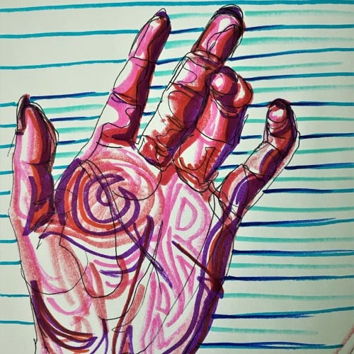
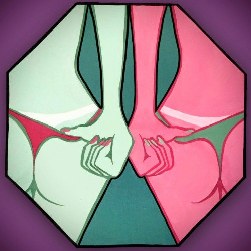
Pop art ink drawing in red, pink, and violet hues. The subject is the palm of a hand and curled fingers. The background has blue, green, and turquoise stripes contrasting the colors of the hand. This artistic drawing style uses non local color to create form in the palm hand drawing.
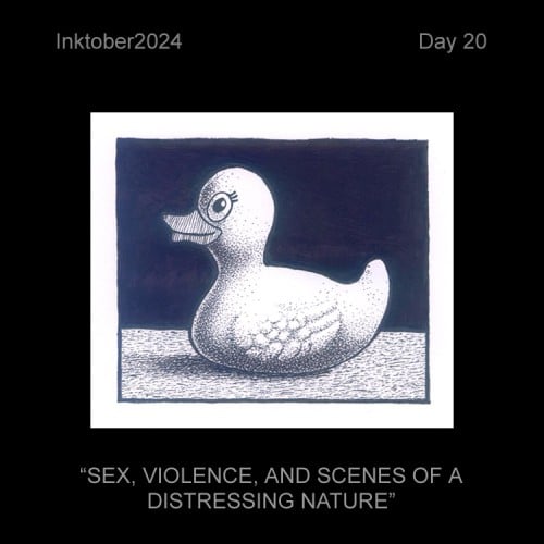
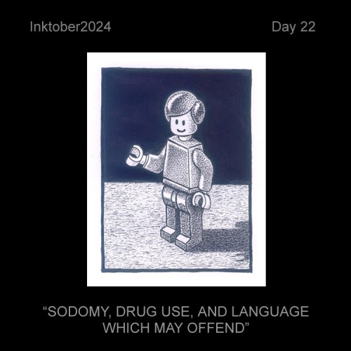
(Gel Fineliner on A5 Paper) The type of artwork which makes you look twice at it due to the title. If it was a photo or a sculpture, I'd probably use a readymade, but here it was something I could easily draw from memory with it being so basic and familiar to everyone.
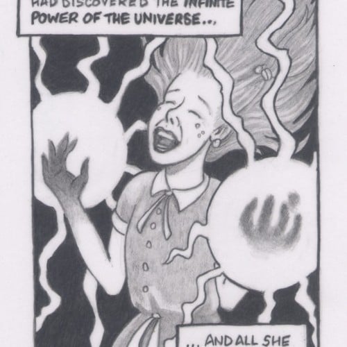
(2B pencil on a 139mm x 87mm postcard. Actual image size is 85mm x 48mm) A juxtapop piece showing a single comic-book style frame with a completely unconnected phrase in the speech bubble.
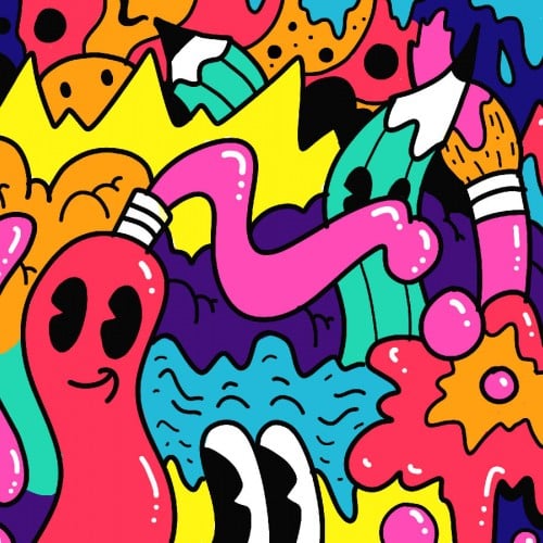
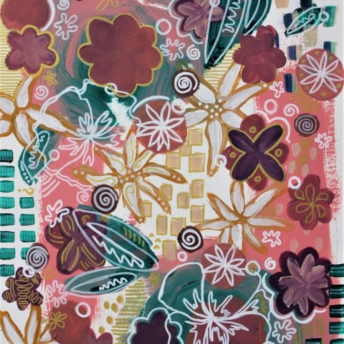
This is an acrylic painting on pre-stretched canvas. It features a pop art style of pink and teal and purple shapes in a sort of abstracted floral pattern, but wait, that's a flower there too. Huh that's pretty cool. Yeah so there's also gold and white flowers too. It's a pretty pretty painting and I should know, I'm the artist. Love, Brianna Eisman
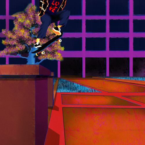
Yet another senseless lynching that has me here with a broken heart. Like my other paintings on this subject, I wanted to focus on life. Tyre was dynamic and energetic, so I wanted to paint him soring. I also wanted to paint him defiant in the face of his oppressors. He was a skater, and they are no strangers to defiance. Thankfully, I found some excellent references to help me with the composition. Aesthetically, I wanted the comp to be modern, colorful, and hopefully impactful. I went for a pop art, illustration, and false-color vibe and minimized blending and refining layer edges. I painted this in Rebelle 6 and Photoshop. Much respect.
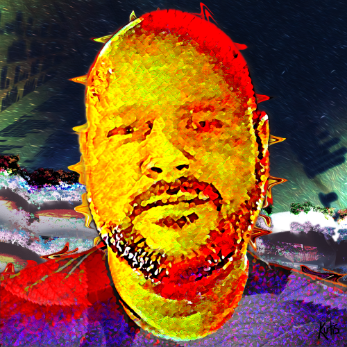
Before I got into digital painting, I was putting together digital collages. I love digital collages, but most of them are a bit too literal/pop art for me. No diss on pop art; I create a lot in that style. But, I wanted to make a smoother, more blended collage for my profile pic.